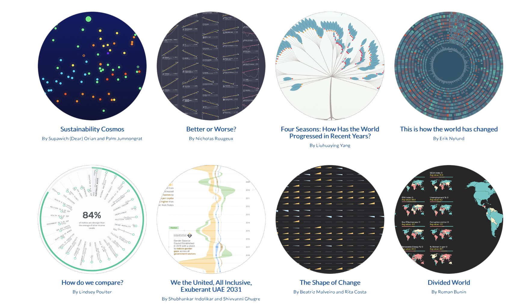
 Via the always excellent Web Curios, we are directed to Information is Beautiful (previously) with its selection of superlative static and interactive infographics short-listed as the most effective and elegant ways of communicating demographics and trends from a given dataset. We especially liked the decade of changes visualisations that immediately laid bare both precarity and opportunity in the Earth Carillon but we expect you’ll discover your own new favourite way of presenting charts and graphs.
this week’s popular posts
-
 The second star of the constellation Ursa Major (the Big Dipper or the Plough or in Arabic بَنَاتُ نَعْشٍ الكُبْرَى , the daughters of th...
 -
 Far from settled or over with the MOU digitally signed, unless America is accepting their defeat in this adventure, the chronology continue...
 -
 After just two months in office, the United Nations decided that they had to strip Wonder Woman of her diplomatic credentials as a role-mod...
 -
 nine days in june : landmark US supreme court decisions of years past and upcoming cases during this busy time of the year mcmodernslopec...
 -
 After several tense hours when an IDF strike of the suburbs of Beirut looked to sabotage the entire negotiations—one Trump said shouldn’t...
 -
 As politicians and the press debate the merits and durability of Trump’s grand deal with Tehran (the administration hinting it will publis...
 -
 bff : open-source branding for fast foods and convenience stores slopaganda : the fake Canadians behind Alberta’s separatist movement ...
 -
 Published posthumously as a collection of YA short fiction from the author’s adult corpus among The Umbrella Man and Other Stories , probl...
 -
 Knowing it was ongoing project, I was not completely surprised to see references to John Koenig ’s Dictionary of Obscure Sorrows circulat...
 -
 Courtesy of Web Curios , we are directed to a global photography project conducted by Matthew Knight between 2008 and 2013 that entailed se...